Material study
The Shape of Balance
Suited to: Design brands and showrooms with distinctive product details.
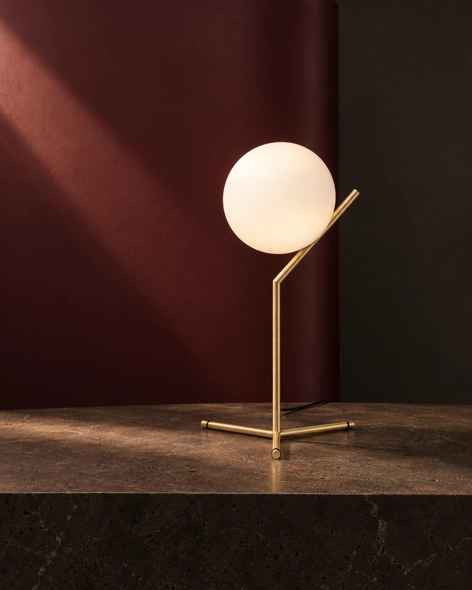
- Communication brief
- Focus an IC Lights product presentation on the relationship between form and material.
- My contribution
- Product art direction, lighting and composition.
- Deliverables created
- A visual study, material detail and a 9-second reel.
The central idea
Build the communication around a distinctive detail.
The relationship between an opal sphere and a slender brass line becomes the subject of the image. The original theme of balance belongs to Michael Anastassiades’s IC Lights design.
How the approach can be used
Colour direction, material detail and a short reel create a focused product presentation. The approach suits a material variant or collection introduction in which the design itself leads the story.
The rhythm of the film
The Shape of Balance
Burgundy, brass and opal. A slow reveal shifts attention from the silhouette to the point where materials meet.
9s
Download filmSilent versionEnglish subtitles translate the on-screen text. The original film and soundtrack remain unchanged.
Download English subtitles (VTT)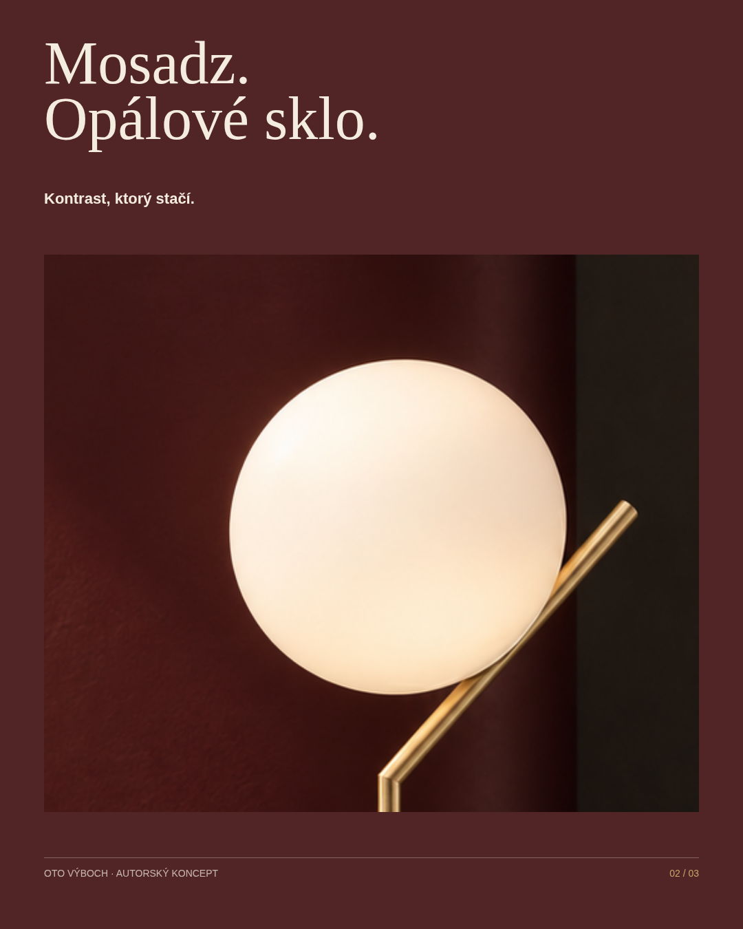
Copy direction
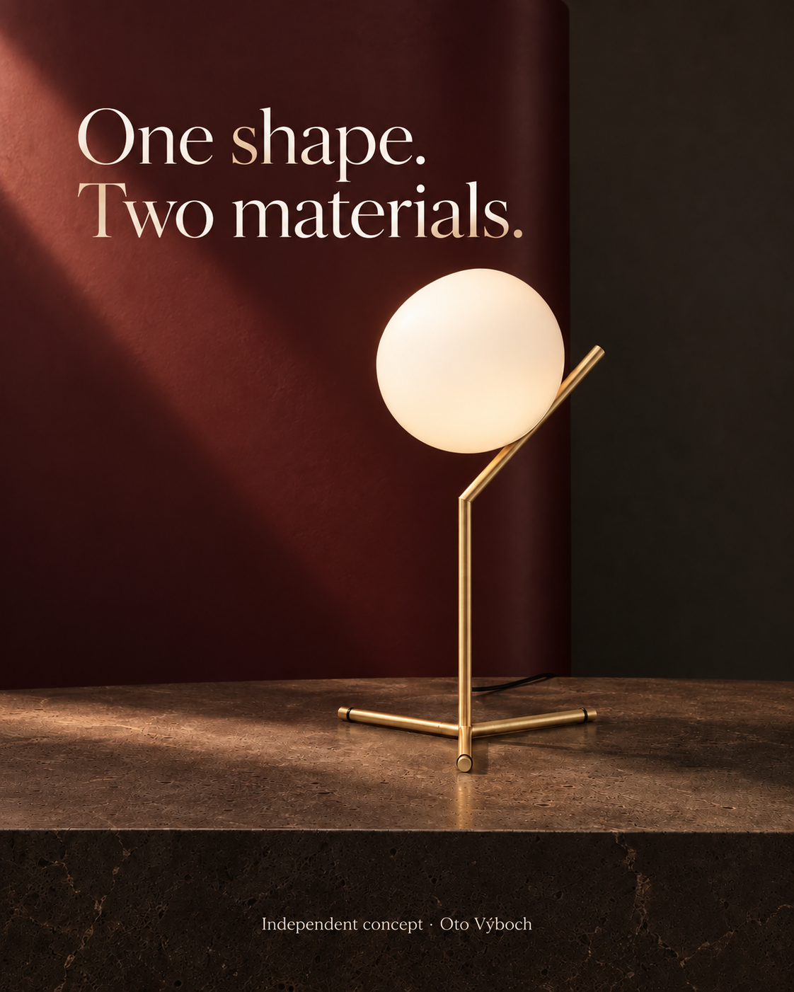
One shape. Two materials.
One shape. Two materials.
Balance takes shape.
Production and context
An independent AI-assisted visual interpretation, not product photography or a Flos commission. My contribution is in colour, composition, typography and the rhythm of the animation.
Source and product context: Flos · IC Lights / Michael AnastassiadesCollaboration
What is your brand introducing next?
A similar collaboration: Product film and visuals
To start, share a link to the product or space and a few words about your goal. If you have a timeframe, include it too. Together, we will define the creative direction and scope for your brand.
Discuss a similar project